Level 1, 13 Maidstone Street, Auckland
+64 9 523 0370
Design Office
An artificial space for real design.
What is the Motion Sickness Design Office?
Everything and nothing. Our new office is best described as a mindset - a fictional space where we can shift our minds to issues of hierarchy, balance, type, and branded pens. A space that allows these topics to be discussed at length, enabling us to decipher and draw out the ‘inner self’ of a bewildered brand.
Where can I find your work?
On the streets, wrapped around your fish and chips, in the cookbook section of your local bookstore, across bitchy advertising blogs, resting on government coffee tables, on your current agency’s mood board, and on the homepage of this website.
Who is in the design office?
Intuitive brand associates, hierarchy hystericalists, strategic overthinkers, and a bevy of soft-handed pixel pushers. We call them designers, and their emotional support squad.
Am I ready to work with the design office?
The first step is admitting your brand needs help, or has potential it has not yet tapped. By virtue of being on our site, we think you’ve come to terms with this. All that’s left now is to plunge bravely into the unknown and email us at designoffice@motionsickness.co.nz
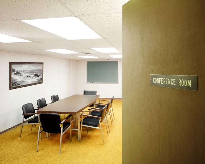
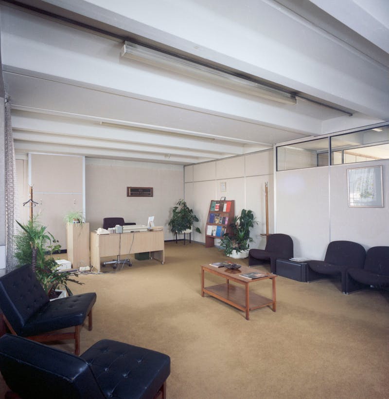
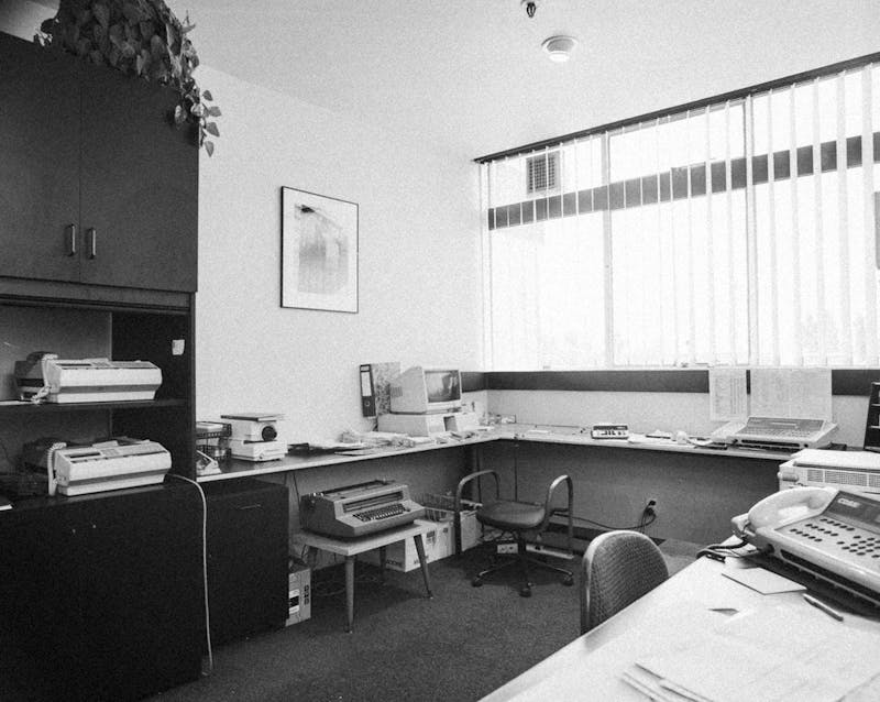
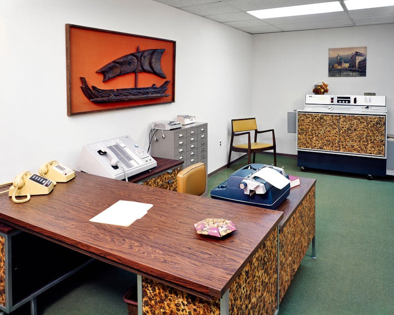
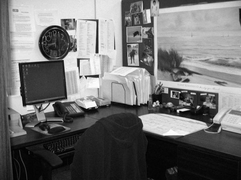
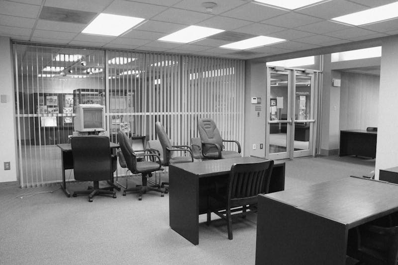
Welcome to the Motion Sickness Design Office, an artificial space created within the physical plane of our existing, everyday office. The purpose of this space is to help us delineate when it’s time to take off our generalised goggles, and instead don design-tinted spectacles.
So, while the pictured office chairs with their questionable stains will be noticeably absent in actuality, you will still find a whole new approach. Here, rather than asking brands what they want to say, we help them discover who they want to be.
An advertising agency and a design agency living in the same house, but sleeping in separate beds - a marriage of unique strength, with the emotional space to be one's own self.
Some would say we give brands a Retinol enriched facial. And, while we make them look good, the work we do is much deeper. We nurse the identity wounds brands carry in a psycho-spiritual retreat of sorts. So, are you ready to chaperone yours into our artificial space for real design?
Motion Sickness Design Office.
An artificial space for real design.
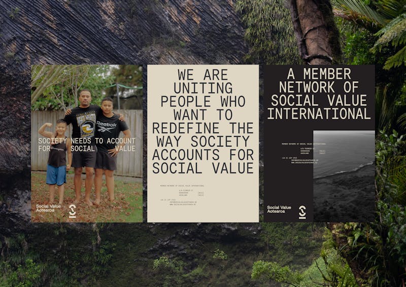
Social Value Aotearoa
An organisation redefining how impact is measured in Aotearoa, and setting standards that prioritise human values like wellbeing, dignity, and belonging alongside economic outcomes.This new identity needed to build clarity and trust, moving beyond abstract terminology to something anchored in people, place, and purpose. Grounded in Te Pā Harakeke, the system weaves mātauranga Māori with global rigour. Contemporary tukutuku systems reflect growth, abundance, and potential. Functional mono type pairs with warm editorial accents, while earthy neutrals are lifted by a vivid rito green – a nod to new shoots and future focus.A brand that seeks to shift conversations from what’s easy to count, to valuing what truly creates lasting change and thriving communities across Aotearoa.


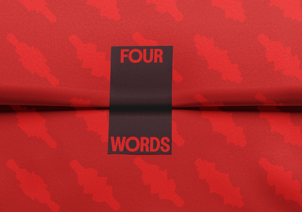
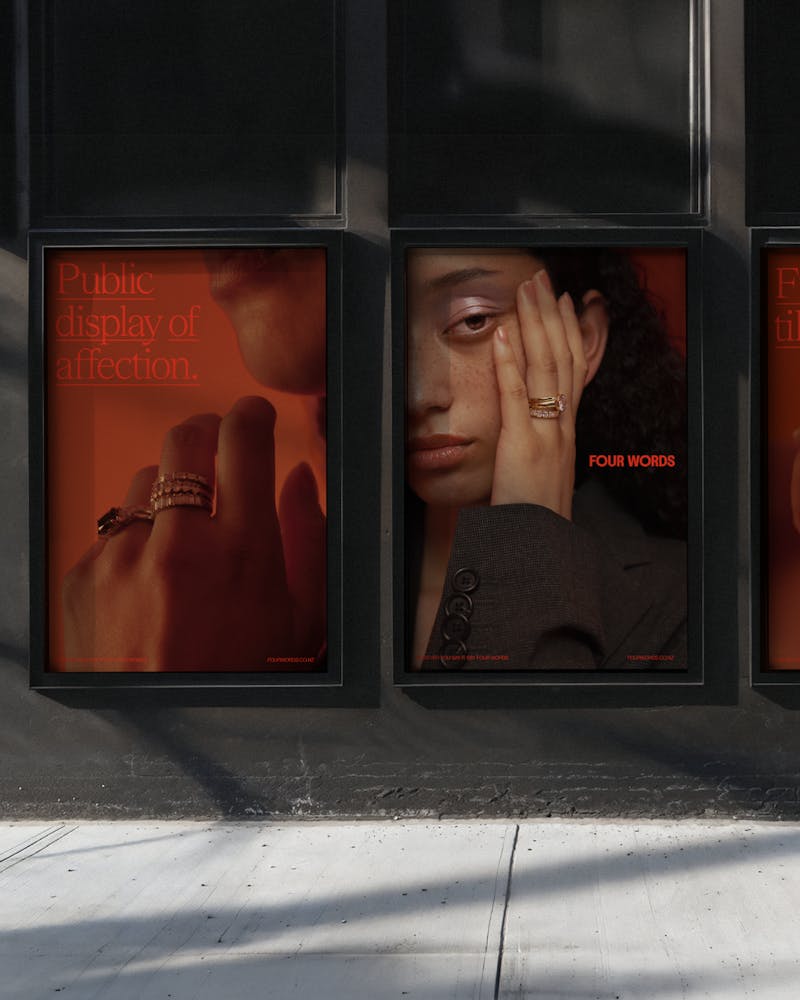
Four Words
Redefining its identity and challenging conventional norms in how love is celebrated. In a market often rooted in tradition, Four Words introduces a fresh perspective—one that acknowledges the complexity and fervour of modern relationships.
Brand Strategy
Brand Identity Refresh
Packaging
Brand photography


You’re Cooked
Arming the intoxicated masses with a bevy of fireproof recipes. A cooked cookbook, if you will. Like any indulgent evening, things get increasingly murky the further you go. You’re Cooked mirrors this, becoming increasingly visually distorted as we progress from chapter to chapter, deeper into the night
Sub-Brand
Book Design
Packaging
Photography


Big Save Furniture
Big Save has been selling beds since before you were born, but the time had come for a big glow up. A simplified logo, refined colour palette for visual consistency underpinned a new modern look and feel for one of the nations most storied brands.
Brand Strategy
Brand Identity Refresh
In-store experience
Brand photography
Campaign Identity


Road by Karangahape
How do you distill the essence of Karangahape Road? By creating a one of a kind fragrance, naturally. Borrowing from the world of luxury smells, ROAD combined real textures from the street, nostril-enticing imagery & cast of local legends to front the fume.
Product Creation
Product Branding
Packaging
Photography


Aotearoa and Bharat Māori-Indian
A manuscript exploring the historic relationship between Māori and Indian communities in Aotearoa. By merging the colour palettes of their respective flags in a harmonious gradient for the cover, we depict their fluid relationship, whilst simultaneously recognising their distinctive identities.
Publication Design


Sorted
Sorted helps you get your money right, we helped them get their brand right.
Staying true to their signature orange, we introduced a refreshed brand identity, modern and vibrant that’s reflective of Aotearoa and the many attitudes towards money in 2024.
Re-Brand
Visual Identity
Campaign Identity


Frank Energy
Energy Online needed a new face, a new body and a new name. Enter Frank Energy. A less is more approach to power. At the centre of Frank’s new visual identity, the Asterisks, a nod to the hidden costs and convoluted contracts often associated with the power category.
Re-Brand
Naming
Full Brand Application
Visual Identity


ACE Advertising Careers
A.C.E (Advertising Careers Engine) – a scientifically complex quiz that matches your personality traits with a dream career in advertising. Your quiz results lead you to unique insights on different ad roles, day-in-the-life videos and legitimate information about ad land on the website. The A.C.E quiz is the catalyst for an upcoming wider campaign to recruit young people by tapping into their quirks.
Naming
Brand
Visual Identity


Whānau Ora
A brand identity challenging the historical shortcomings of government-backed bodies meant to serve Māori. The subsequent campaign identity of , ‘Our Future is Māori’, is reflected through uniquely Māori storytelling, community collaborated film and confronting media placements.
Visual Identity Refresh
Website Re-skin
Brand photography


Christmas 2024

Christmas Burner Phone
To ensure clients committed to truly tools down summer, we gifted them with a deliberately dysfunctional Xmas gift: The burner phone. Useless in all facets and cased in bespoke packaging that reminds you to look outside the inbox.
Product Creation
Packaging


Quit The Tit

Quit The Tit
New Zealand: a nation of proud cow's milk drinkers, hesitant to alternative suggestions. Enter: Quit The Tit. A bespoke tit-milk quit-kit that helps kiwis wean off the dairy with an appropriate alternative.
Sampling Box Packaging
Campaign Identity


Translator
Designers and clients don’t always speak the same language. Our proprietary translator ensures optimal synergy between creatives and corporates.
There’s some great thinking here.

Hey just wondering if you got my last email.

The illustrated character’s face looks a little smug.

Thank you in advance.

We need to appeal to a younger audience without alienating our existing customer base.

This is a jump for us.

What if we did a design sprint face-to-face.

Can you resend the link?

We need to run this by the team.

It's almost there.

Translator
Designers and clients don’t always speak the same language. Our proprietary translator ensures optimal synergy between creatives and corporates.
I would love to discuss these changes on a call. Just let me know when suits?

We’ve intentionally utilised negative space as a means to frame and reinforce the core idea and messages.

We are really proud of this. We explored multiple creative territories, tested 13 logo placements, discussed form, and now feel this brand element will be an evergreen asset for your brand in the future.

We’re almost done.

This aesthetic is trending right now.

This is essential to enhancing the design experience.

Thanks for your email.

That’s a great suggestion.

We’re pushing the boundaries of your brand identity.
